Client Brief:
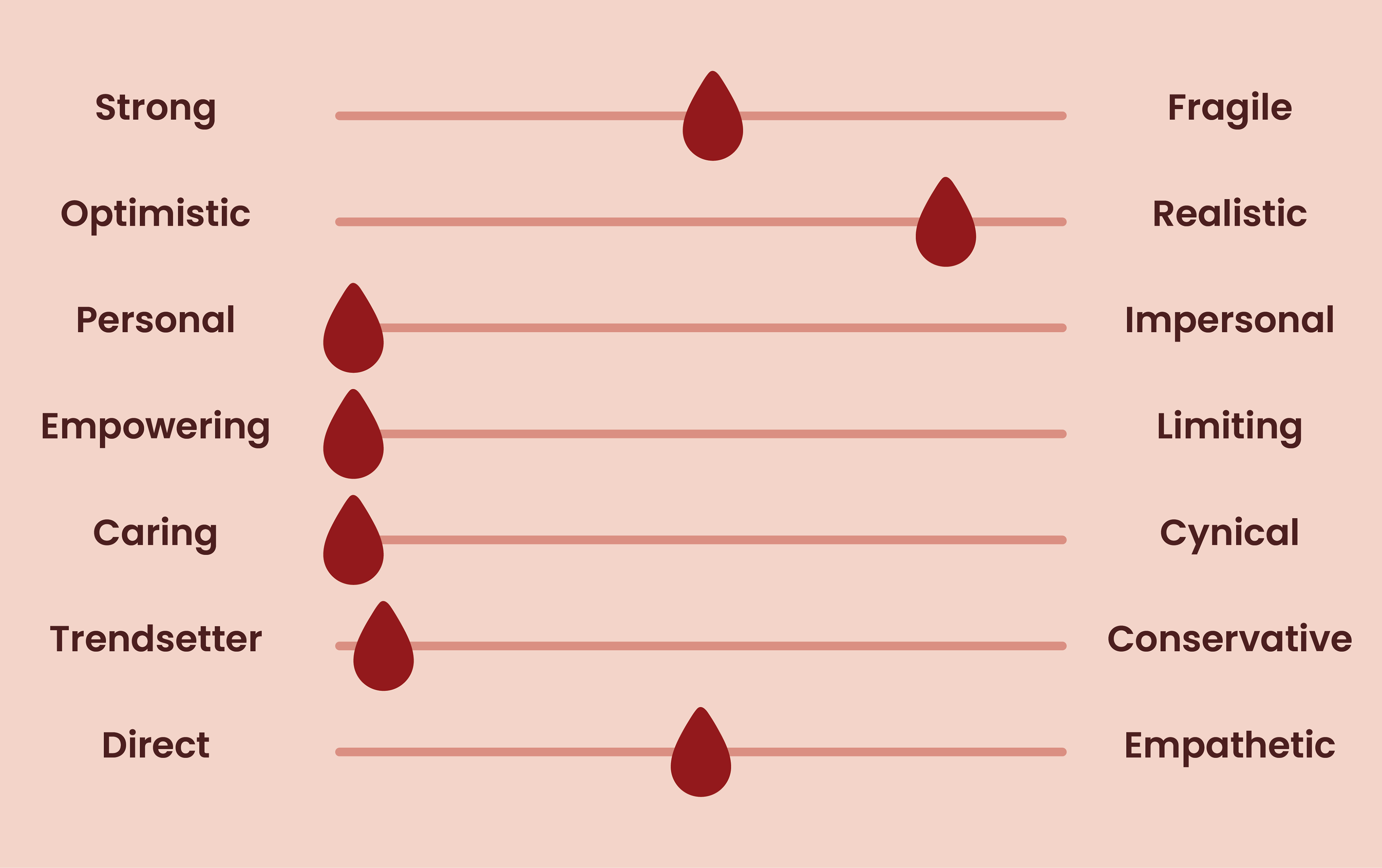
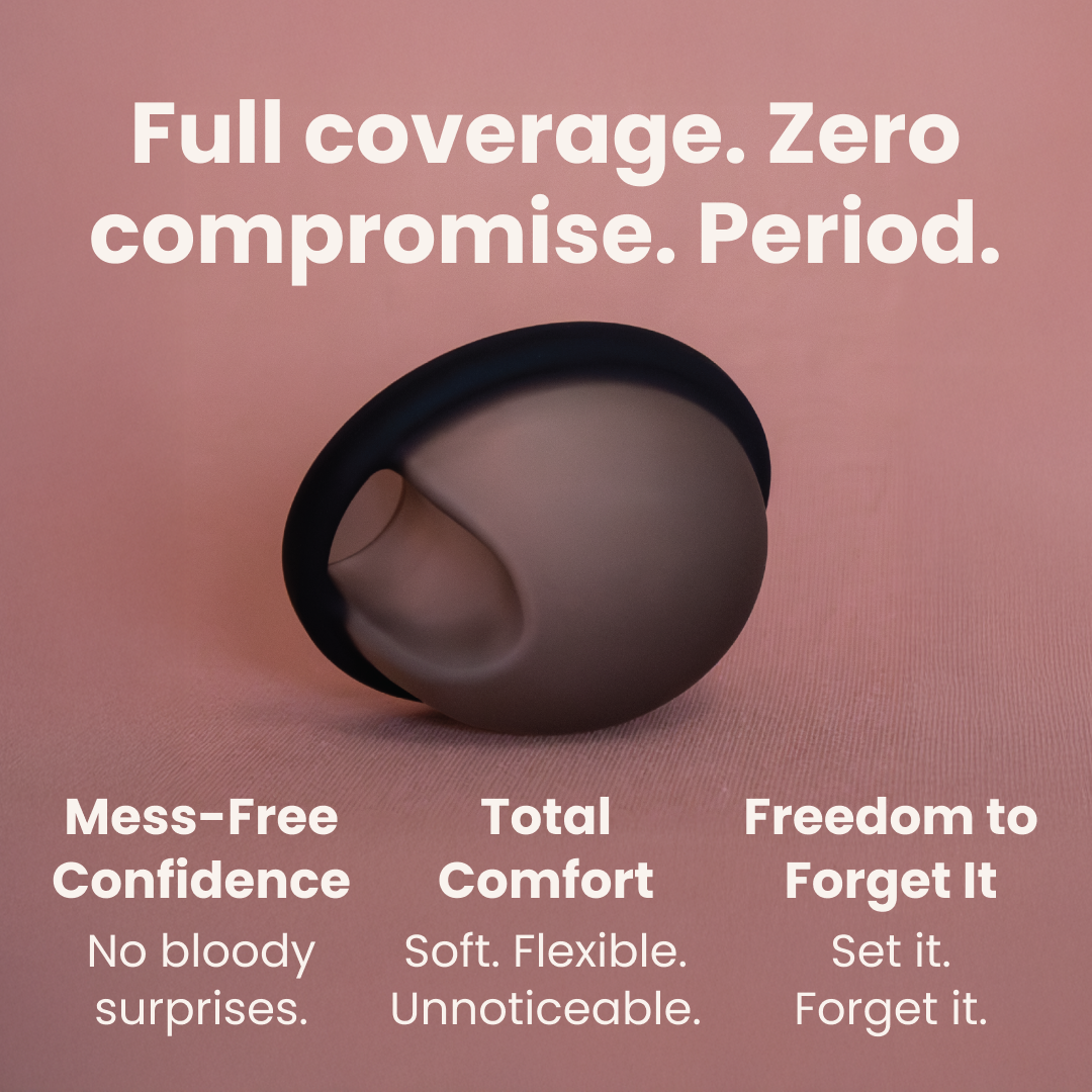
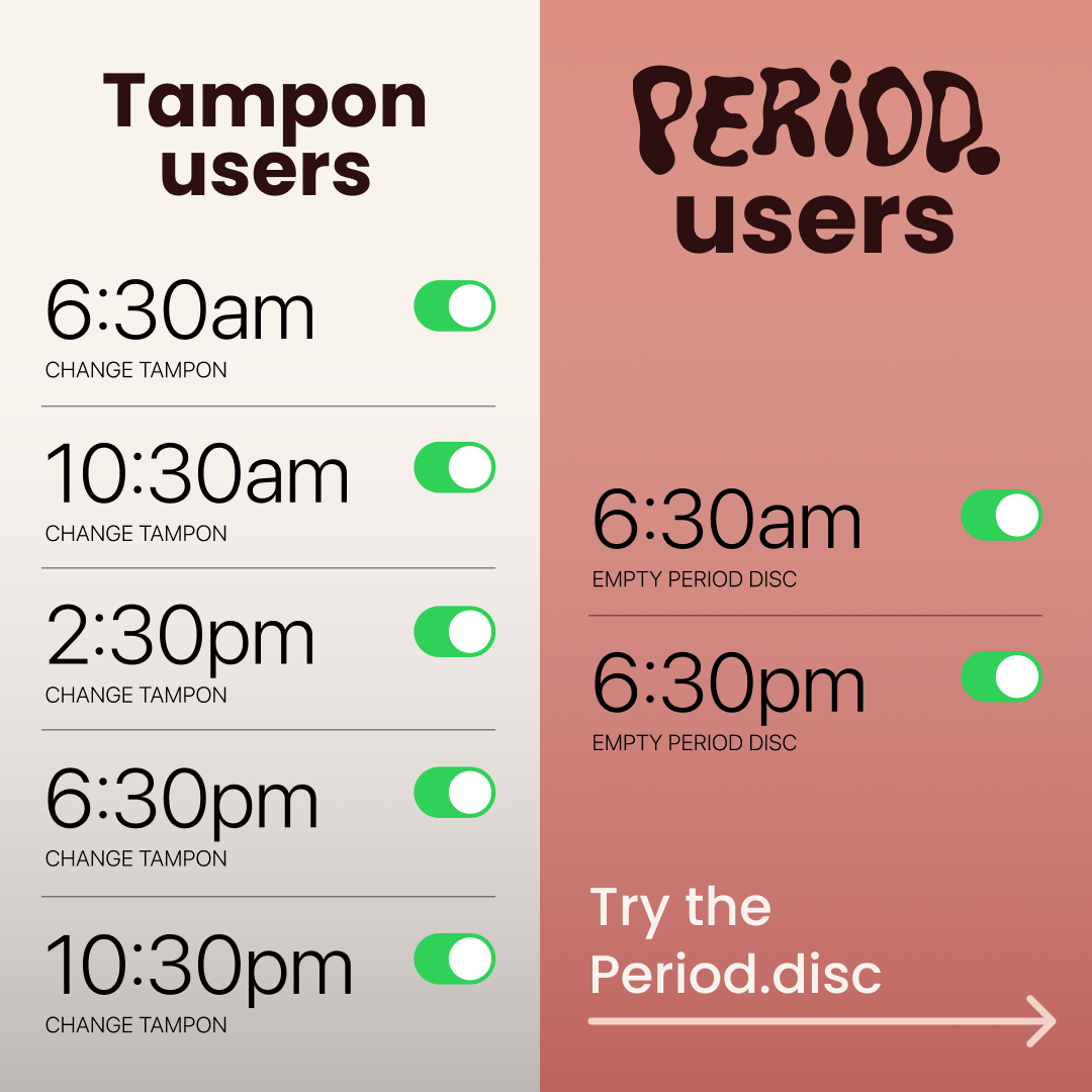
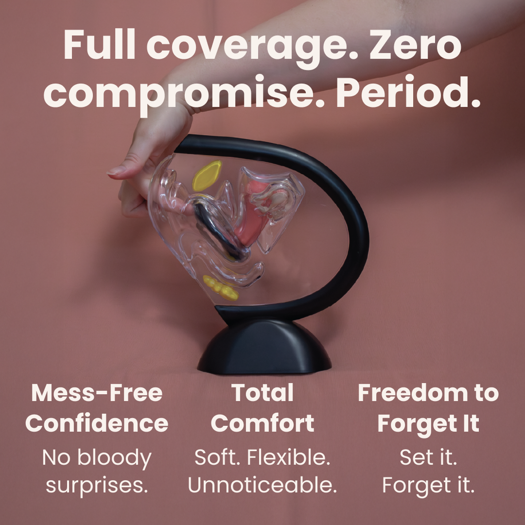
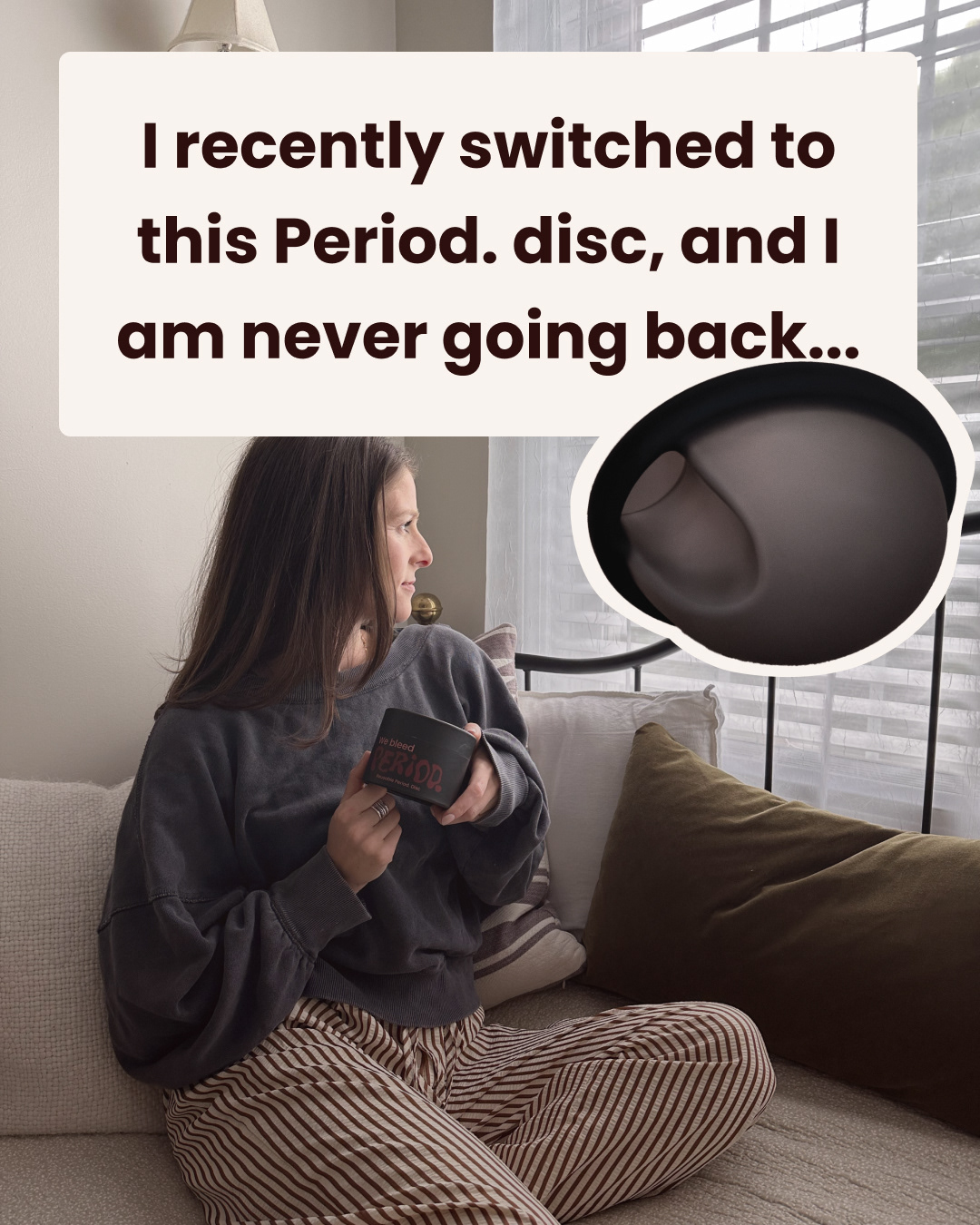
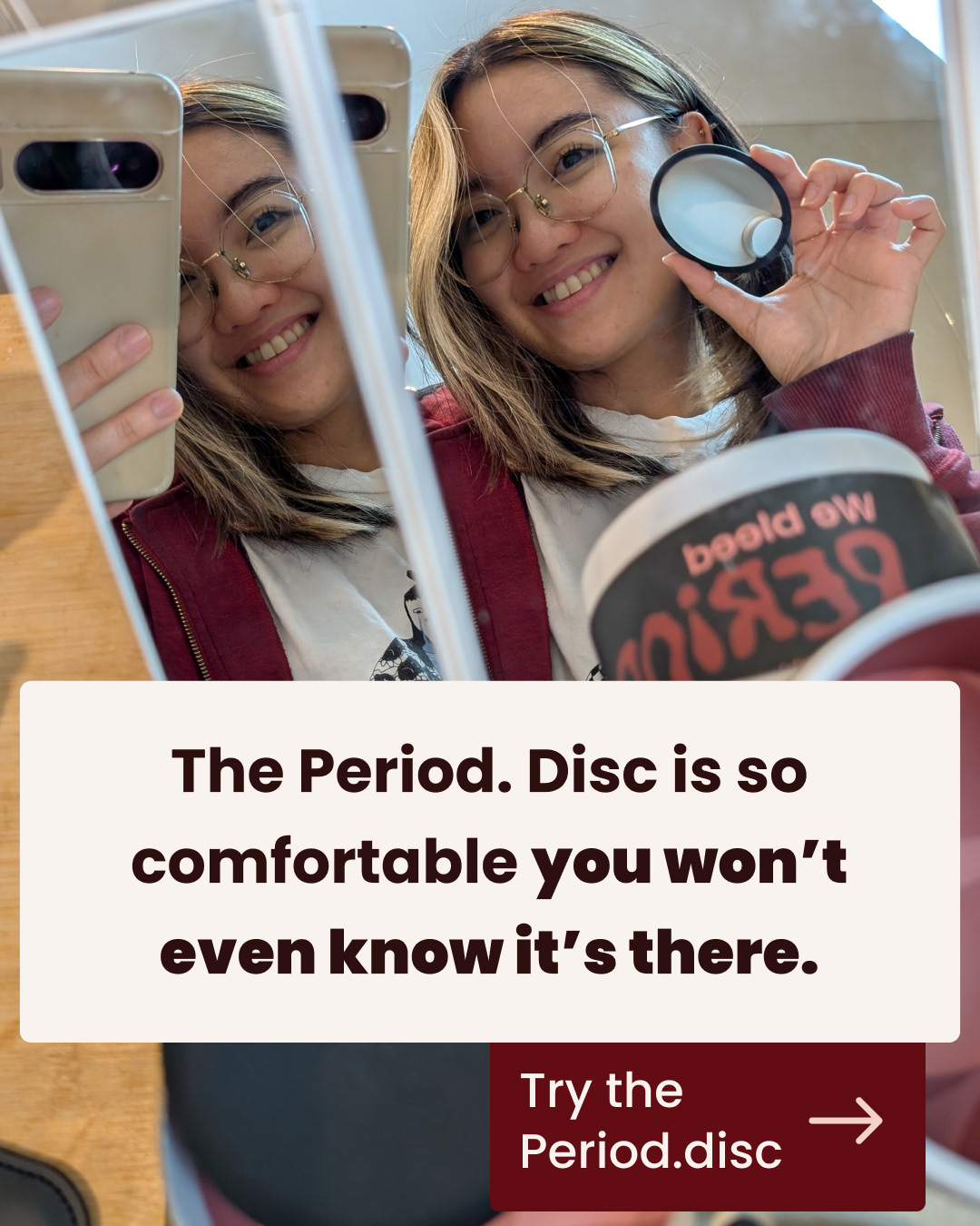
The startup behind a new menstrual disc product wanted to create a brand that broke with norms and stood strong in the market. I developed Period. - a name that serves both as a statement and a reference to menstruation. With an empowering strategy, honest communication, and a visual identity inspired by the colors and texture of blood, the brand became a tribute to women's authenticity.
The result: A name, a logo, and a mascot that make it clear the discussion is over. Period.
The result: A name, a logo, and a mascot that make it clear the discussion is over. Period.
Role: Project Manager, Creative Strategist, and Graphic Designer.
Client: Startup
Category: Branding and visuel identity.
Context: Freelance
Manifest:
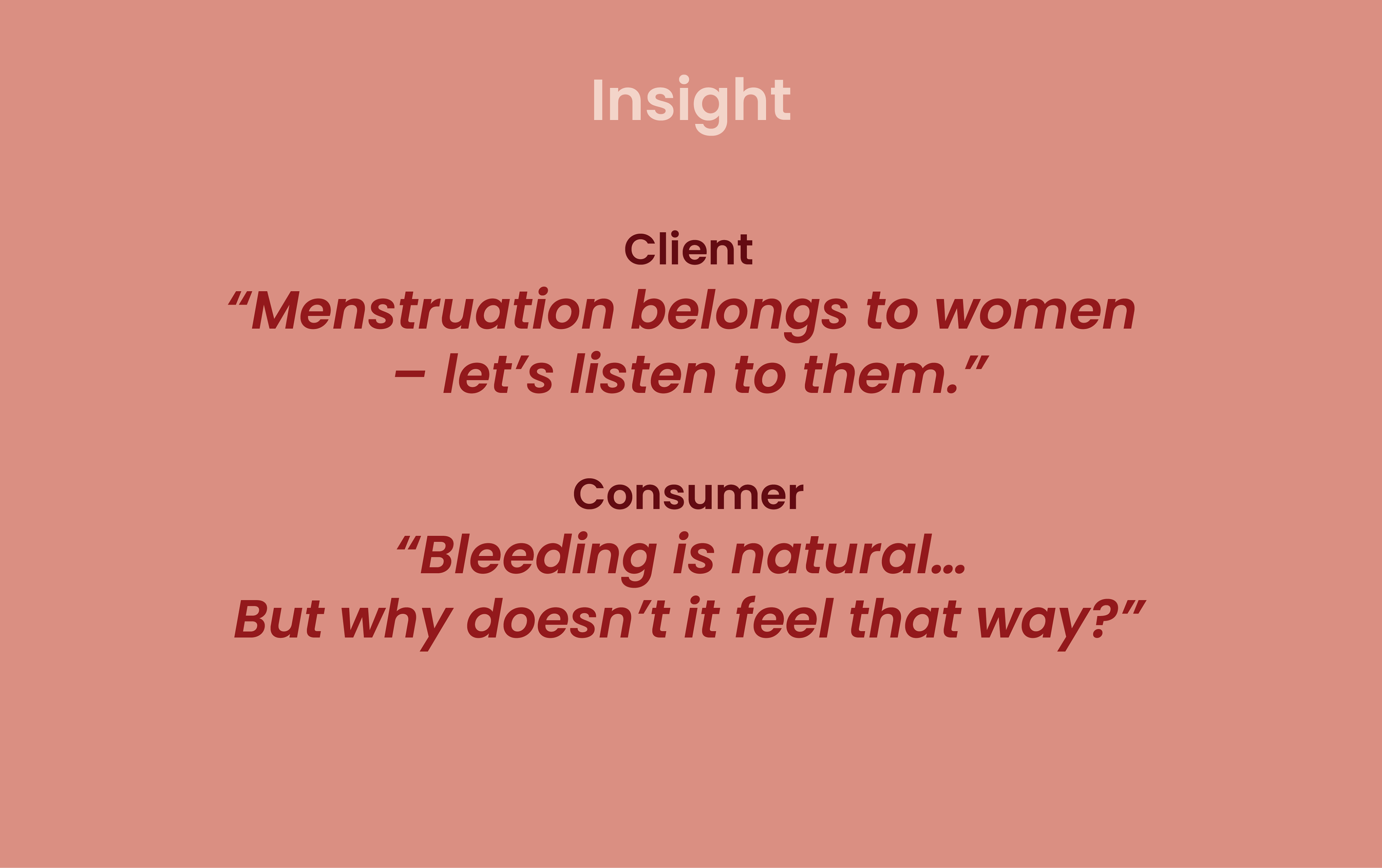
Still in this period of time women are asked to fit in, to be smaller, quieter, simpler. But your cycle reminds you of something else - that you are complex, emotional, and deeply human.
We’re stepping forward, unapologetically, to show how natural it is to be an angry woman, a joyful woman, a sad woman, a tired woman... to show how natural it is to simply be a woman.
Through every moment, mood, and cycle, we stand as a reminder: your emotions are not a weakness, your period is not a secret - and your voice matters.
We’re here to remind you: you are enough, just as you are. No apologies, no hiding – just acceptance.
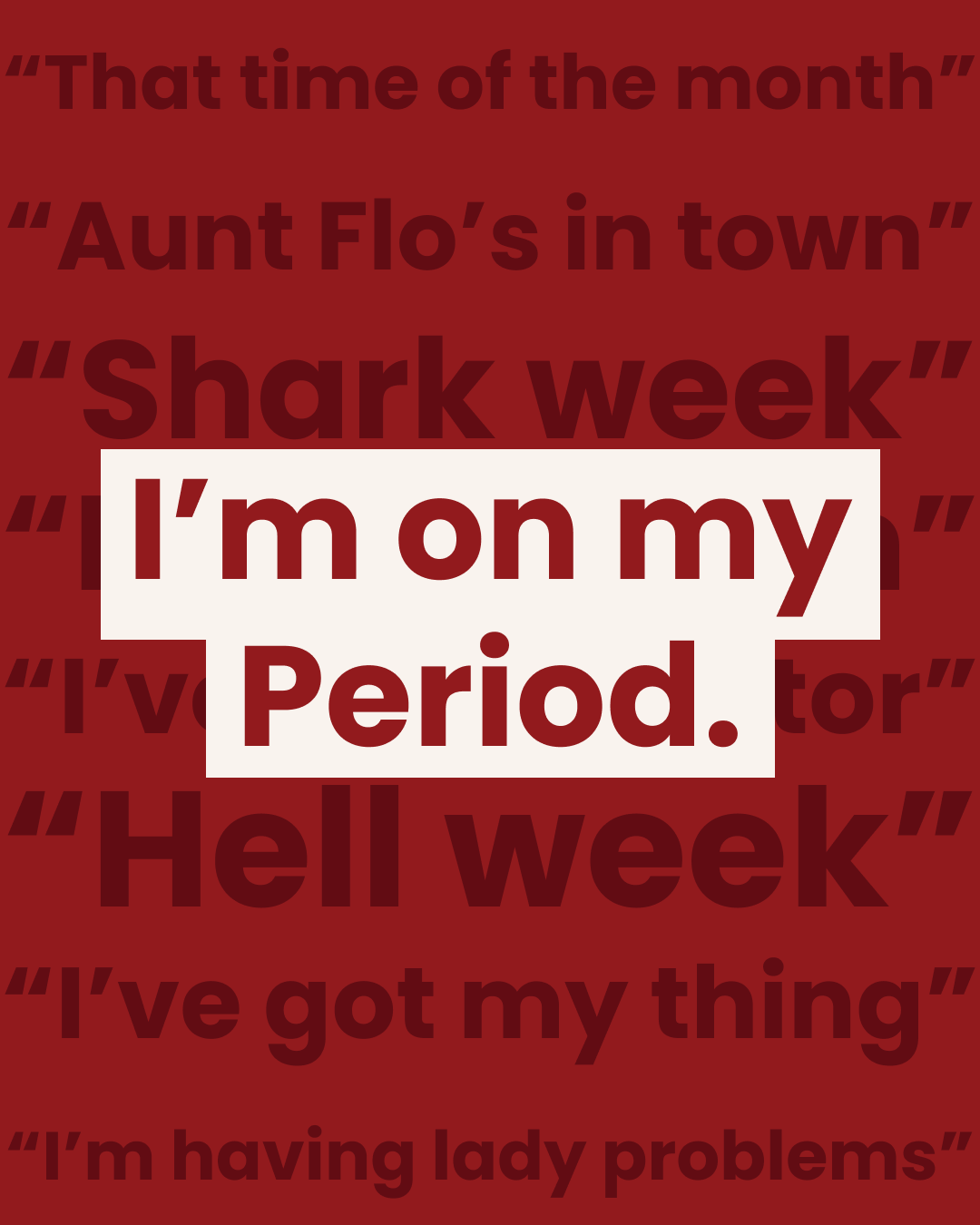
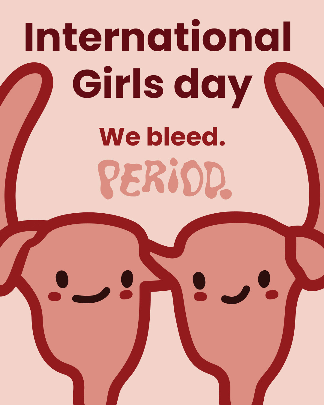
We bleed. Period.
Tagline:
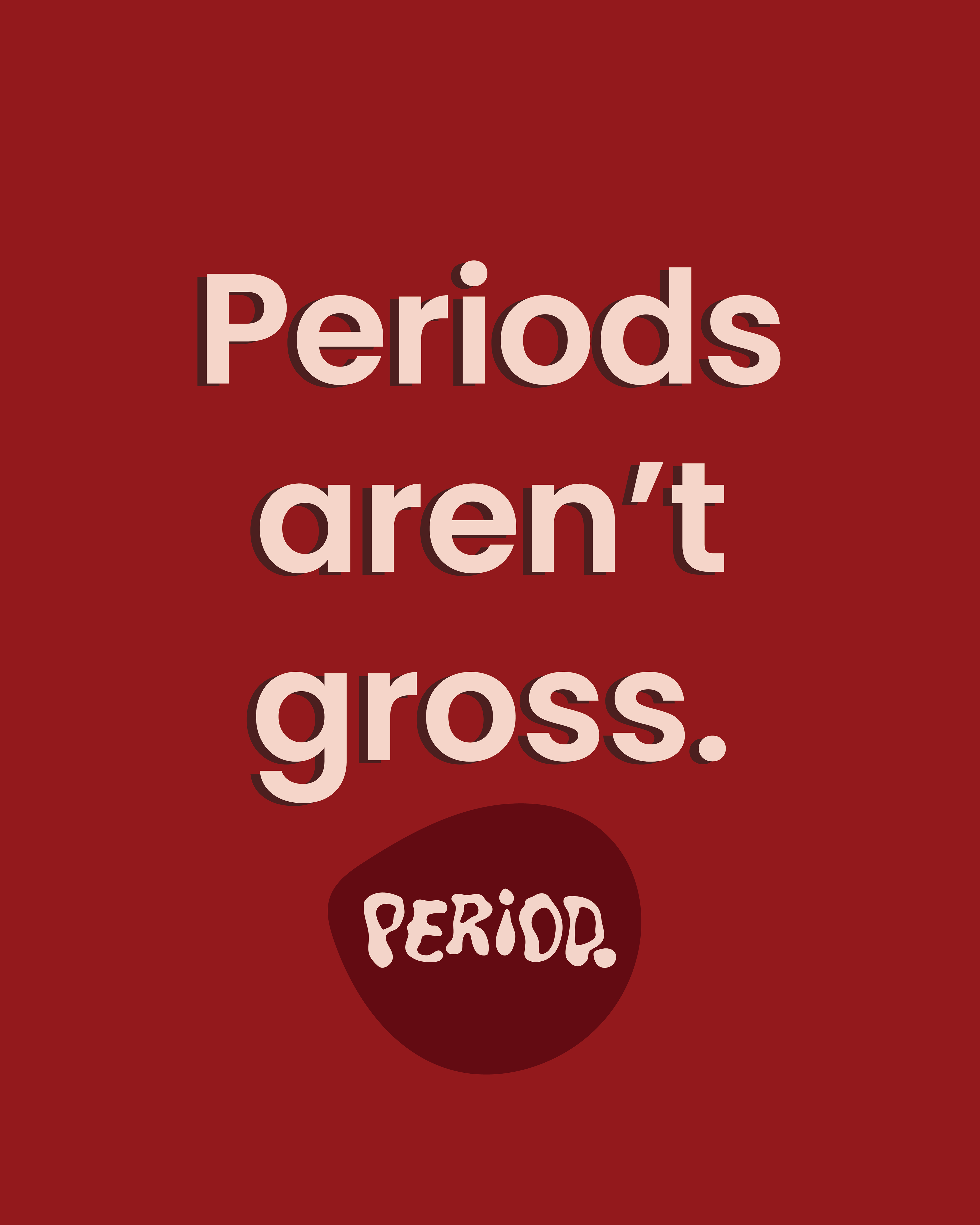
A bold and unapologetic statement that embraces the reality of menstruation while shutting down the stigma.
A bold and unapologetic statement that embraces the reality of menstruation while shutting down the stigma.
We bleed. Period.
Logo:
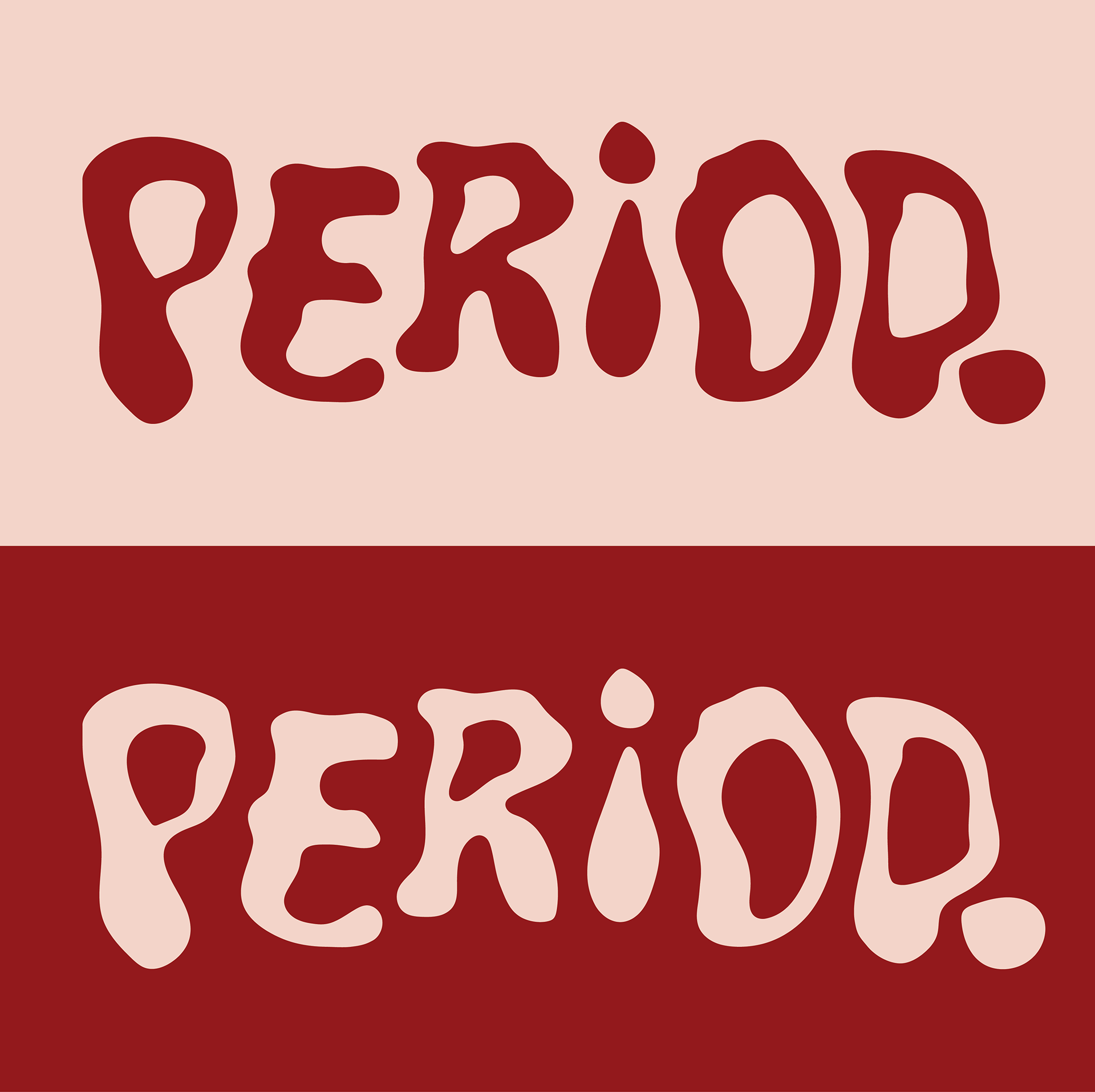
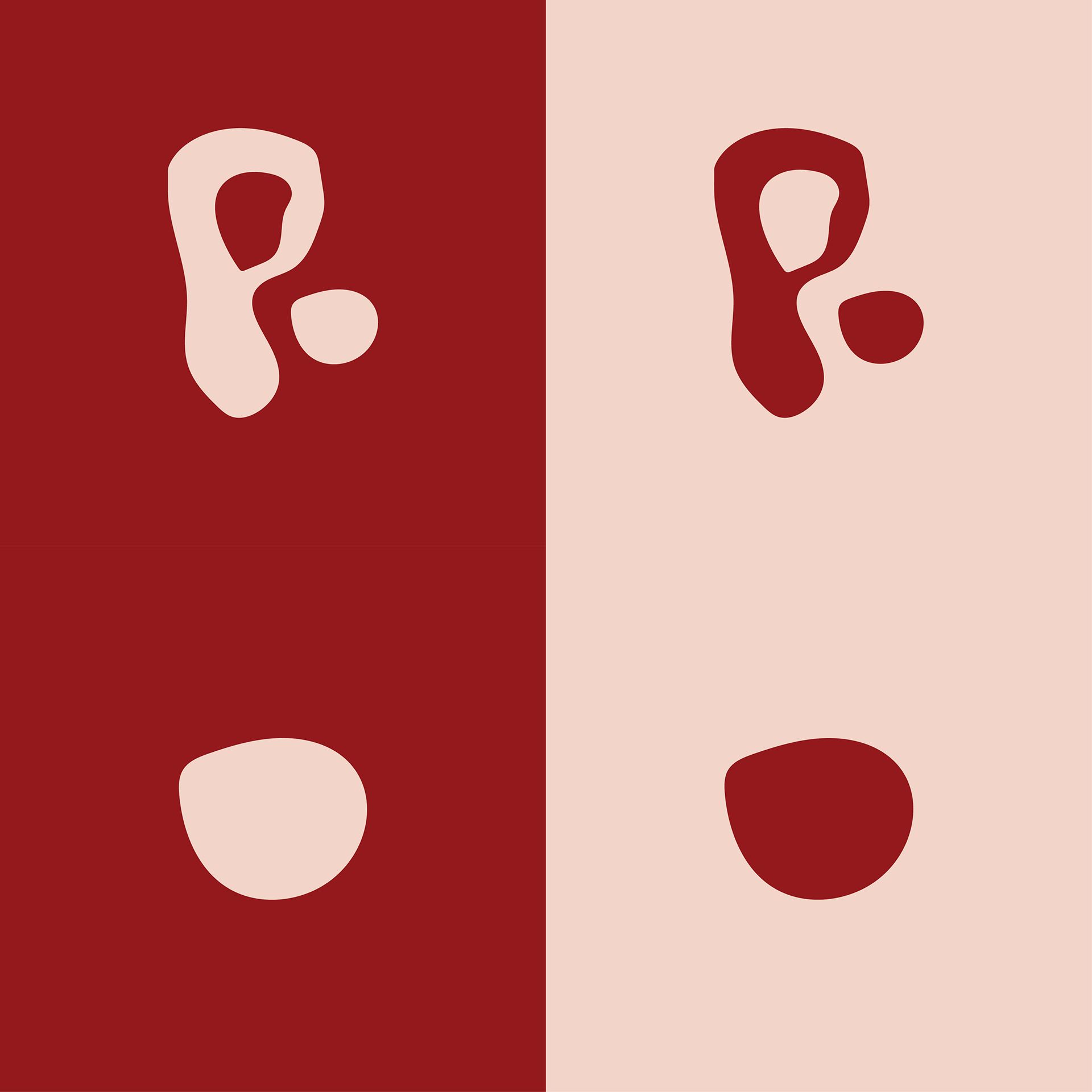
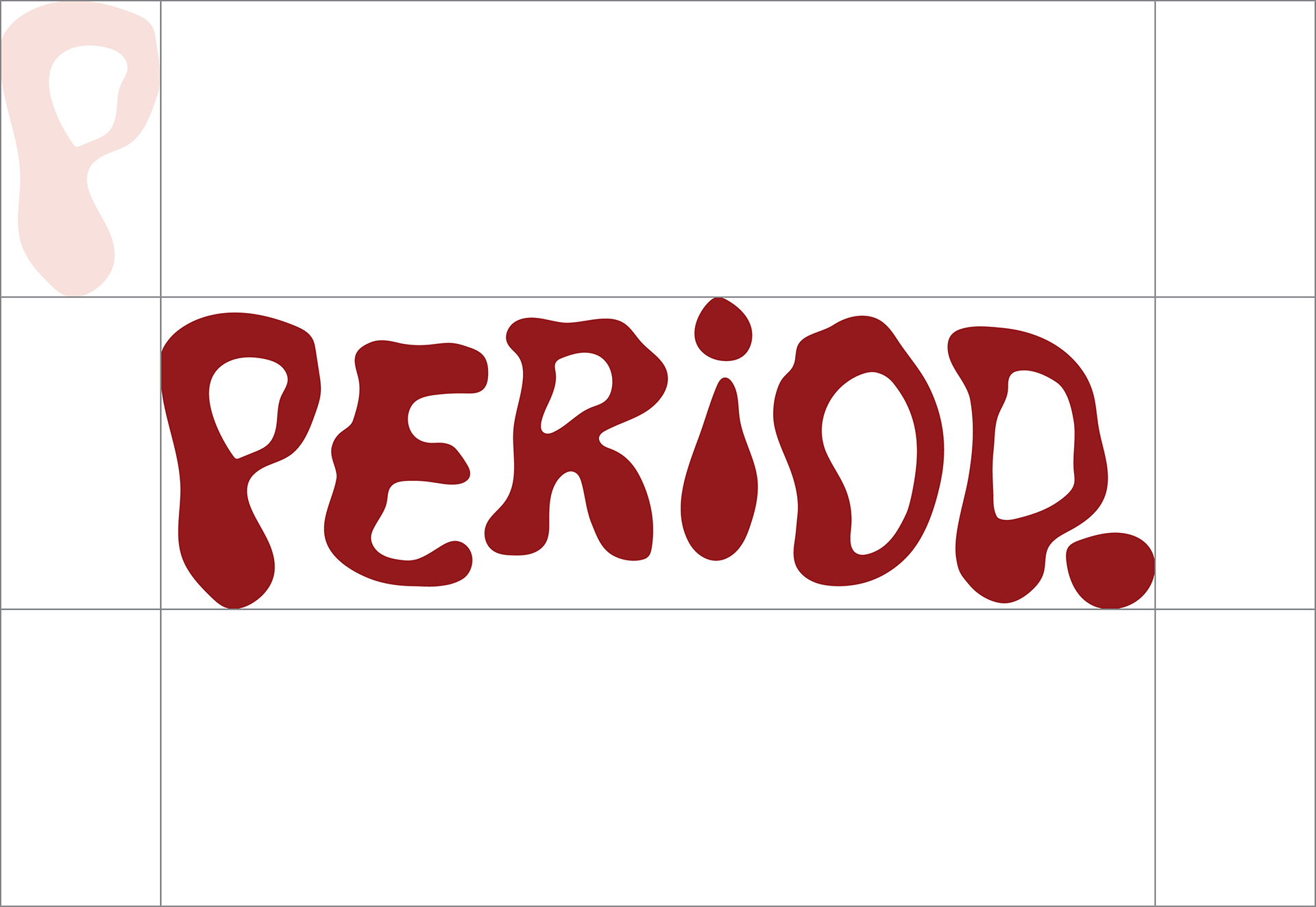
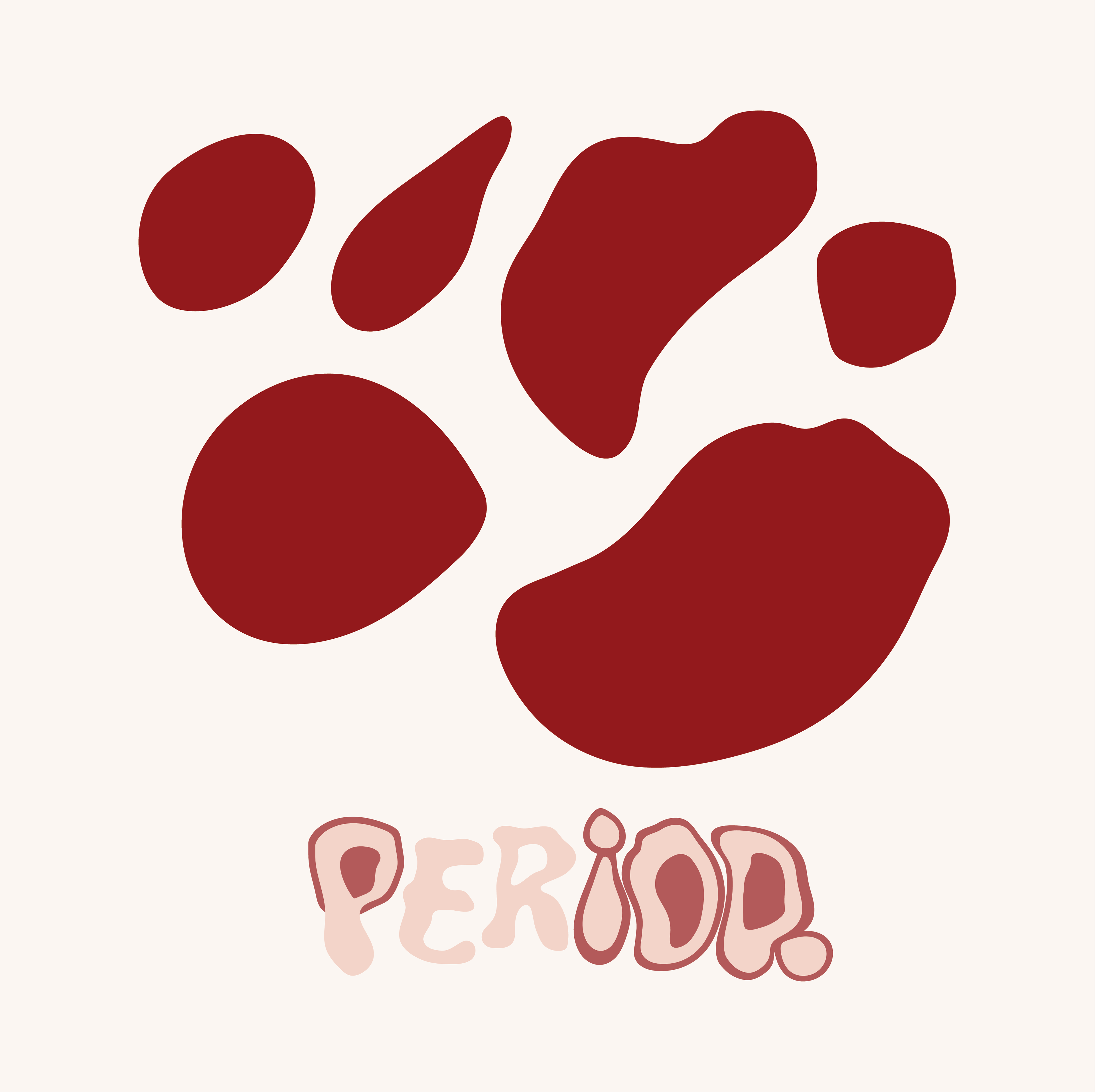
The logo is not just inspired by periods - it is made from it. Created using real period blood and then hand-drawn on paper, the organic shapes emphasize the raw, natural essence of the cycle.
This bold approach transforms something often stigmatized into a symbol of empowerment and authenticity.
Primary colors:
The brand’s primary colors are inspired by menstruation - deep, rich reds and warm, organic tones that reflect the natural hues of blood. They create a powerful and honest visual identity that challenges outdated taboos.
Secondary Colors:
The secondary colors offer variation while staying true to the essence of menstruation. Softer tones complement the primary palette, providing versatility and depth to the brand’s identity.
Icons:
A balance of soft and sharp edges in the iconography mirrors the duality of menstruation - both natural and powerful. These icons serve as visual cues for different aspects of the cycle, embracing both vulnerability and strength.
A balance of soft and sharp edges in the iconography mirrors the duality of menstruation - both natural and powerful. These icons serve as visual cues for different aspects of the cycle, embracing both vulnerability and strength.
Mascot:
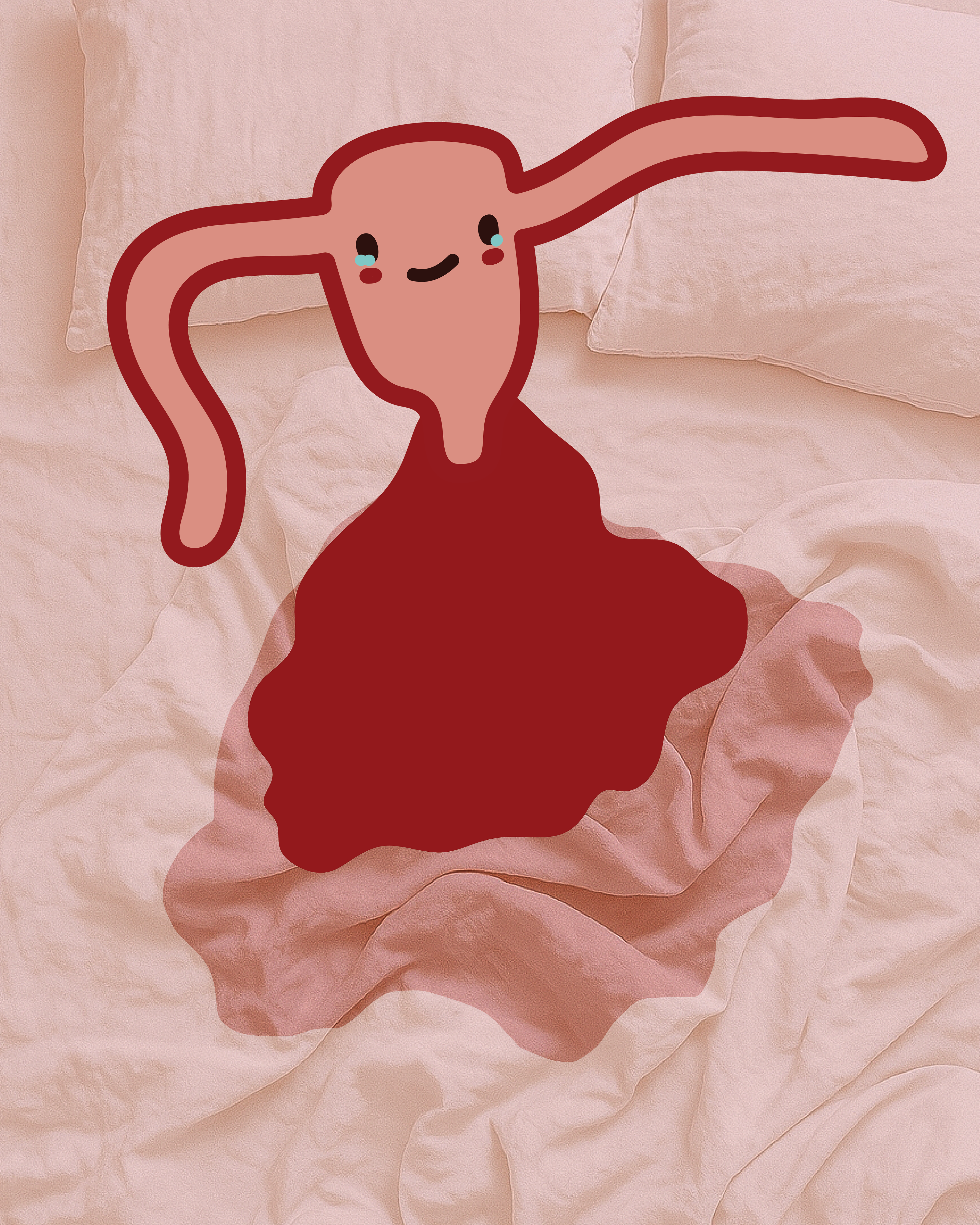
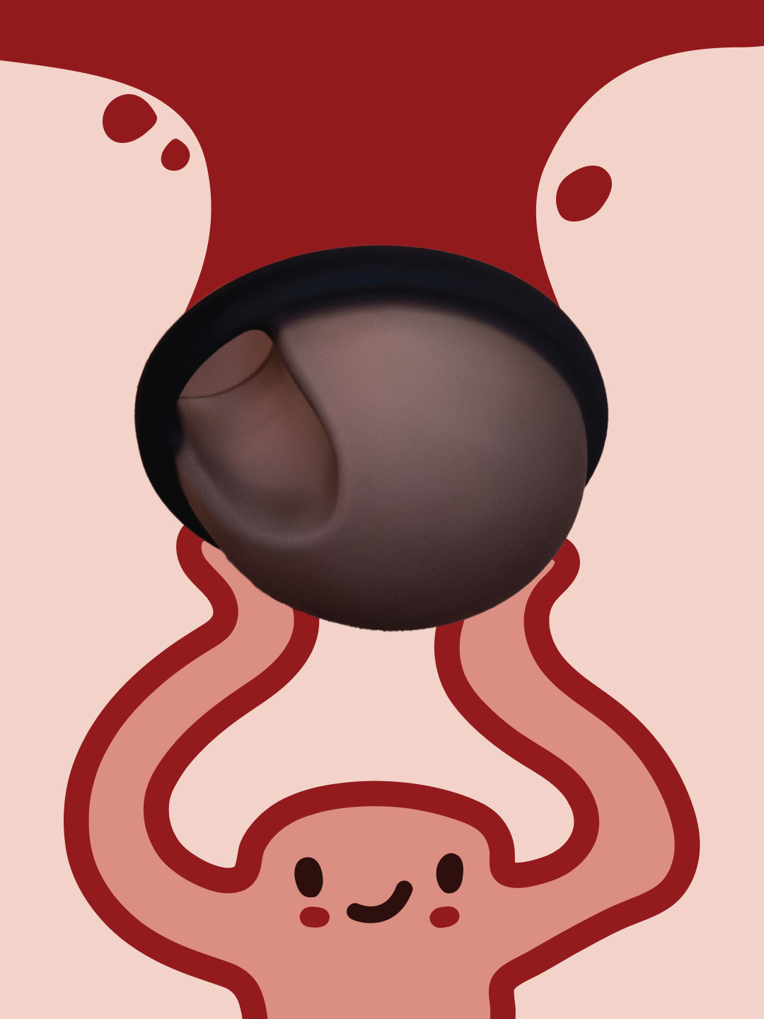
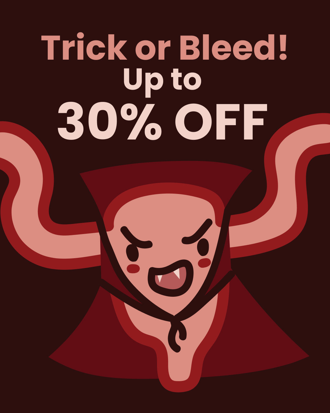
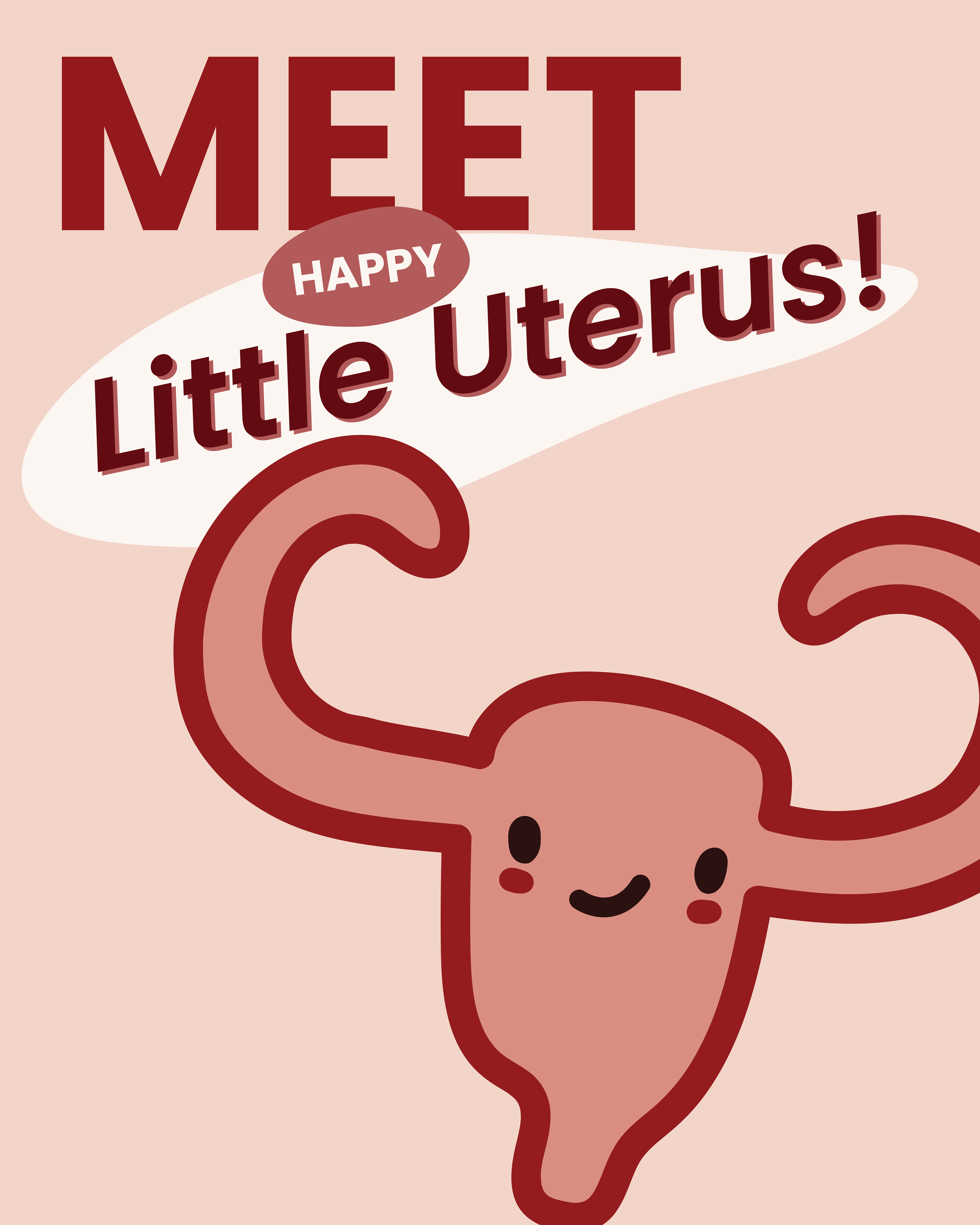
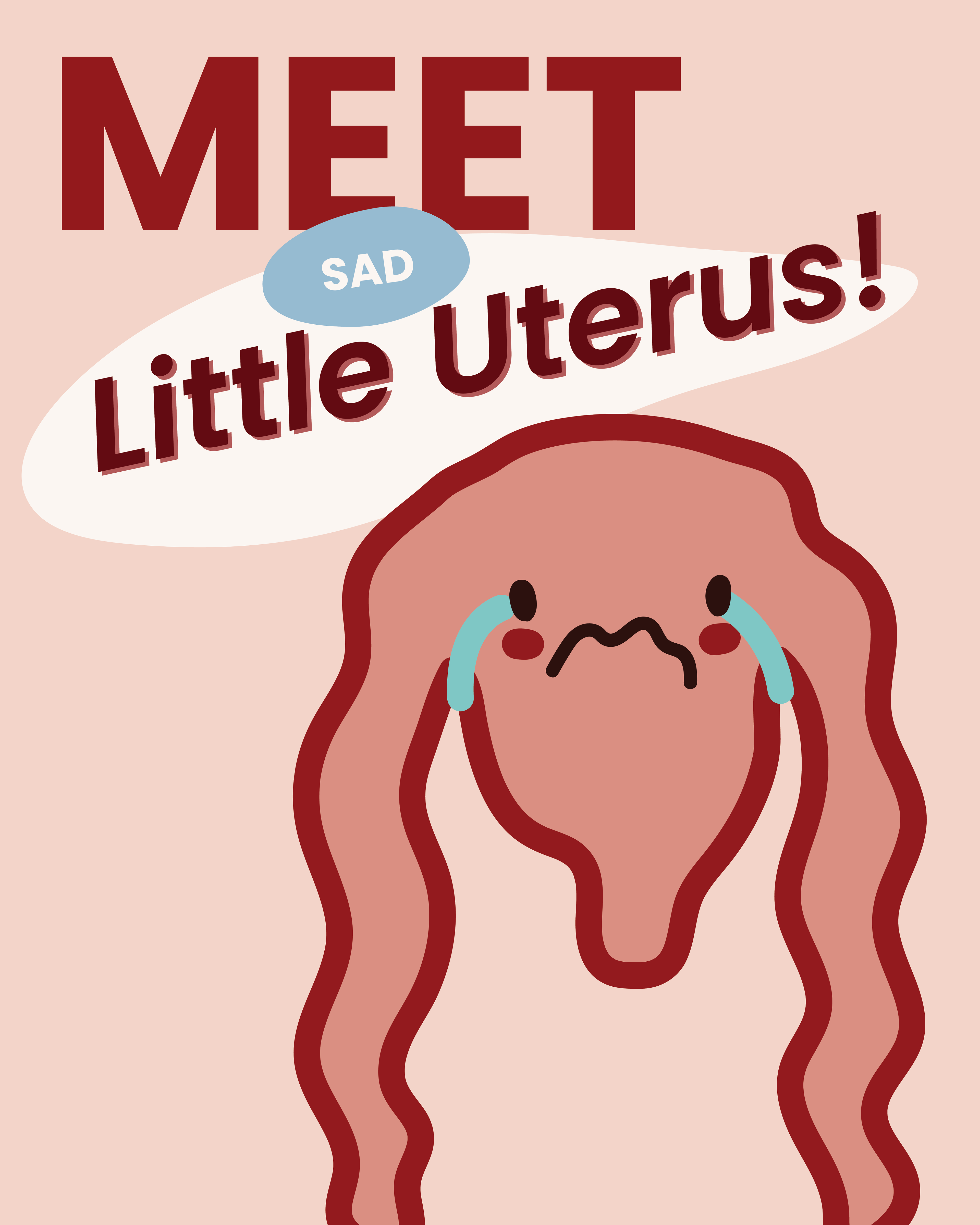
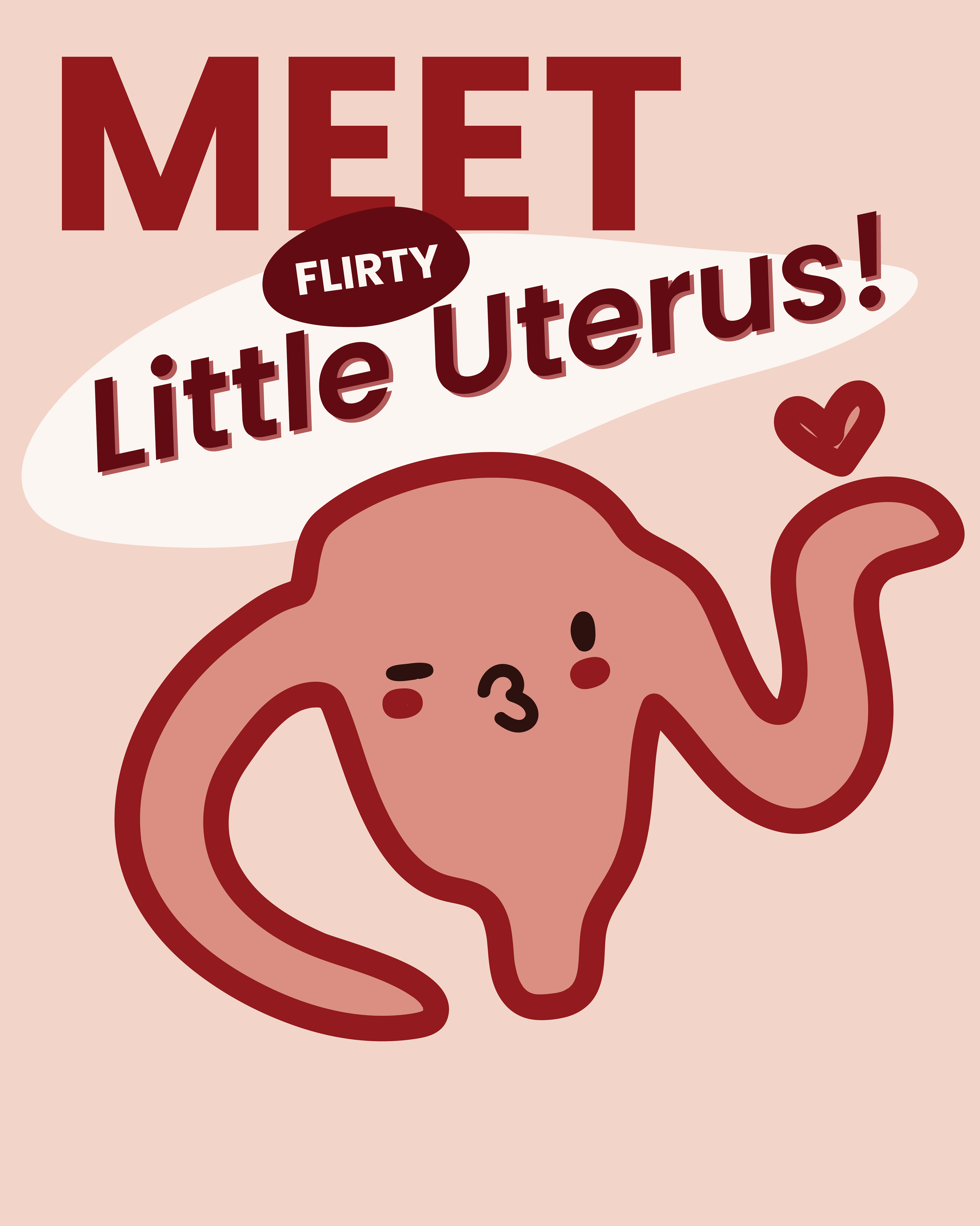
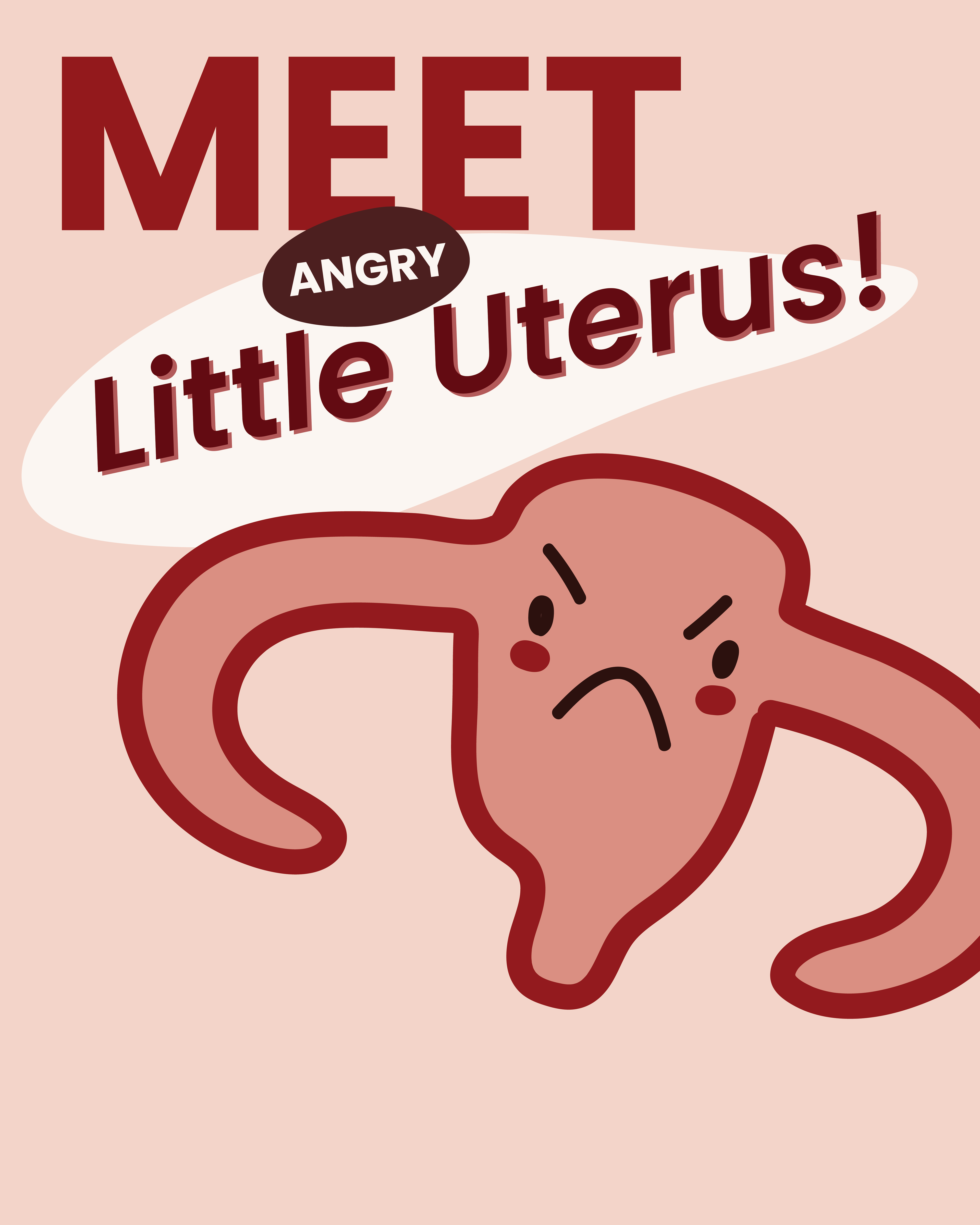
At the heart of the brand is our uterus mascot, designed to express a range of emotions - anger, joy, exhaustion, relief - because all feelings during a cycle are valid. It humanizes the conversation and reinforces the message: menstruation is natural, and so are the emotions that come with it.


Teamwork:
Emma Lenau
Frederikke Zander Kaehne
